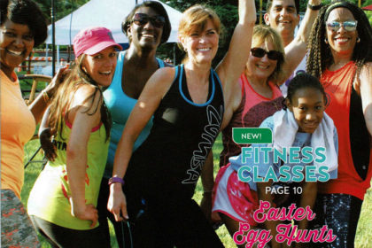
 For lifelong learning programs, the print brochure is the cornerstone of all marketing efforts and the cover of the brochure is where a program can make a splash – or fall flat – with potential students or customers.
When designing a brochure cover, consider these five key design and informational elements:
Use a large, centrally focused image
The best cover images create a strong and lasting impression on potential readers. You have three seconds to capture the reader’s attention and drive them further into the brochure. Brochures with one centrally focused image do a far better job of this than covers that incorporate several smaller images. Using a single image will help the reader focus and understand the message you are trying to convey. Several small images can create confusion and the reader’s eye won’t know where to focus. Three seconds is not enough time for a reader to digest multiple images with different themes and multiple images can lead to disengagement. Also, single large images stand out better if your brochure is displayed in public. A larger image can be understood from a distance, where several smaller images can just create confusion.
Make sure your program’s identity is clear
Many brochures don’t focus enough on the program’s identity. Headings like “Recreation Guide” or “Community Education Classes” do a good job of expressing what the brochure is all about, but you also want to clearly express who you are. Maintaining and boosting your program’s brand awareness in the community can go a long way. Cover images, taglines and headings can change from brochure to brochure, so you want to make sure you have elements of your cover that stay consistent and will make sure community members can easily identify your program at first glance.
Brand yourself with a logo and slogan
Though it is important to have new and fresh elements to every cover (image, teaser copy), it is also important to have element that don’t change and promote your brand awareness and identity. Two if these elements are your logo and slogan. Having a consistent and recognizable logo gives you a visual cover element that can build familiarity. An effective and catchy slogan can do the same thing linguistically. Keeping these two elements consistent from cover to cover will build trust and awareness of your brand in your community, something very important for continuing and community education programs.
Include teaser copy
Having too much copy on the cover of a brochure can often confuse and distract a reader, but when used correctly cover copy can really motivate a reader to dig further in. Instead of talking about policies or registration on the cover, highlight some new, popular or seasonally relevant classes or programs. It can just be the class names, or you can use a short, catchy phrase to get the reader’s attention. Also include page numbers so that an interested reader can jump right to the highlighted class or program. Often classes highlighted on the cover see an increase in enrollments.
Include your URL (but not your address or phone number)
Though it may sounds strange, it is far more effective to have your programs web address on your brochure cover than your physical address or phone number. With more and more students registering online, making your URL as visible as possible is important. Also, a good URL should be catchy and simple so it sticks in the readers mind. Physical addresses and phone numbers don’t afford you that luxury and are not something that a reader will remember from looking at the cover. When they need that information, they will find it inside the brochure.
