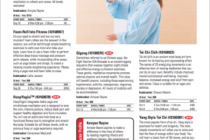
 You want these pages to have visuals entry points to help engage readers, especially casual readers just flipping through the brochure. We recommend having at least an image on every other page, that way no matter where someone flips the brochure open to they have a visual to engage with.
For the course titles themselves, we recommend bold, black text. Bold, black text always stands out better than colored text and since the course title is where you want the reader’s eye to be drawn first, black text works the best. Colored text can work well for subject and sections headings and to brighten up a page, but bold, black text will create the most attention for your course titles.
Make sure you write your course descriptions in second person, “you” language. This makes your descriptions more personal and creates the illusion that you are speaking to the reader. This builds more trust and helps the reader feel comfortable registering for a course. The only exception to this would be if you are writing descriptions for youth classes where the reader is really the parent.
 When listing your course logistics, try to do it in as little space as possible. This will allow you to have more space for course descriptions and visuals throughout your brochure. Also, don’t use bold text for your logistics because you want the reader to first see the course title, then the course description, and finally the logistics. Often times the logistics can be seen as negative to the reader. For instance if they look at the price first and feel it is too high. They might not have felt that way if they had read the description and seen the value of the course first.
Consider also making sure you mention the instructor. Students often take classes just because they enjoyed taking a previous class with that instructor. It is also a great practice to highlight an instructor or two in each brochure. Highlight them with their image, a short bio and a list of what they are teaching. This will help prospective students feel more connected with that instructor and feel more comfortable trying a class with them.
Overall, you want to craft course listings pages that are clean, visual and draw the reader in. You want their eyes to first be drawn to the titles, then the descriptions and finally the logistics. Well-crafted and organized course listings pages will lead to better customer engagement and more registrations!