The first two pages of a brochure bridge the gap between the attention grabbing aspects of the brochure cover and the real
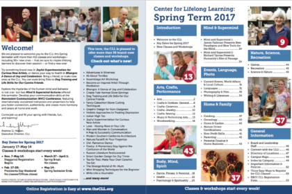
The most important aspects of the first two pages are the table of contents and a welcome statement. The table of contents should list classes by topic category and give enough information so the reader can make an informed decision about where to flip to in the brochure while not being too long and listing every class. The table of contents should stand out well on the page and no be overshadowed by the other design aspects or stuck in the corner of the page. Bold ink should be used so the contents stand out well and can easily read.
LERN recommends including a short welcome statement on one of the first two pages that’s purpose is to welcome readers to the brochure and entice them to read further. We find that the best welcome statements are relatively short and to the point and speak directly to the reader in second person, “you” language. We recommend that the welcome statement come from a real person like the program director or similar position and include their image and signature. This will make the statement more personal and
“welcoming.” A well-written welcome statement should excite the reader and entice them to delve deeper into the brochure.
The rest of the first two pages should be filled with images, testimonials, class highlights and white space. Try not to include registration information, lists of board members, or program policies. This information will not be necessary until the reader has found something they want to take. Therefore these first two pages should be dedicated only to design aspects that will drive the reader further into the brochure.

